Judith Sutton ABR CRS IDS PMN ASP IAHSP SRES GREEN
Judy@JudithSutton.com 908 803-0472
EXPECT MORE
A dominant color in nature is the color green and its variations have the power to evoke feelings of abundance and vitality, as well as promote a sense of calm, sophistication, and well-being.
Here are some of my favorite shades, and how to use them.
Sage
Just like the savory and delicious herb, Sage Green is pale in color with yellow and gray undertones. Sage Green represents easy sophistication and serenity. Combine it with bright colors like purple and gold, or muted colors like rose and light gray, to create a more contemporary palette.

Mint
Mint Green is also a pale shade, but it is more vibrant than Sage. Associated with freshness, creativity, and friendliness, Mint Green is a cool shade with blue undertones. Mint Green pairs with most shades of green to create a refreshing color palette, or with blues, browns, purples, and white for a more modern take.

Olive green
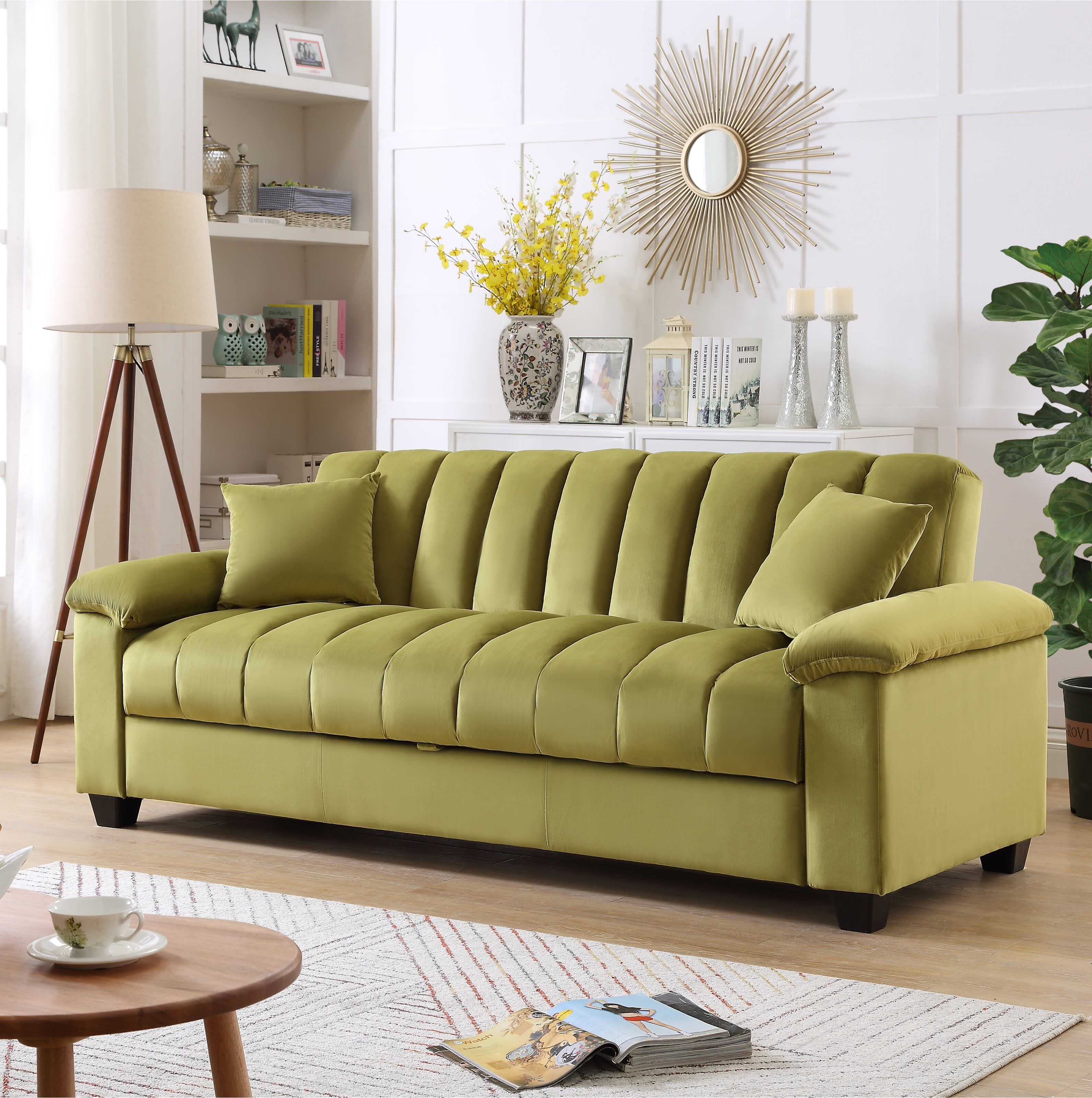
Named after the fruit from olive trees, Olive is a muted mid-shade of green that evokes earthiness thanks to its gray and brown undertones. Starting to overtake Sage Green in its popularity due to its versatility, Olive Green can be used to reflect many different moods. Paired with darker hues such as brown and black it can create a serious mood, or paired with rose, pastel yellow, and lilac, a contemporary and playful palette.

Emerald green
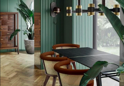
Emerald Green is bright and vivid. Based on the gemstone, Emerald Green is often referred to as a jewel tone, known for being striking and saturated. Often denoting regality and wealth, Emerald Green also recalls luscious botanicals or plants you may already have in your garden. Emerald Green exudes a sense of richness when combined with any of the metallic colors.

Turquoise and Teal
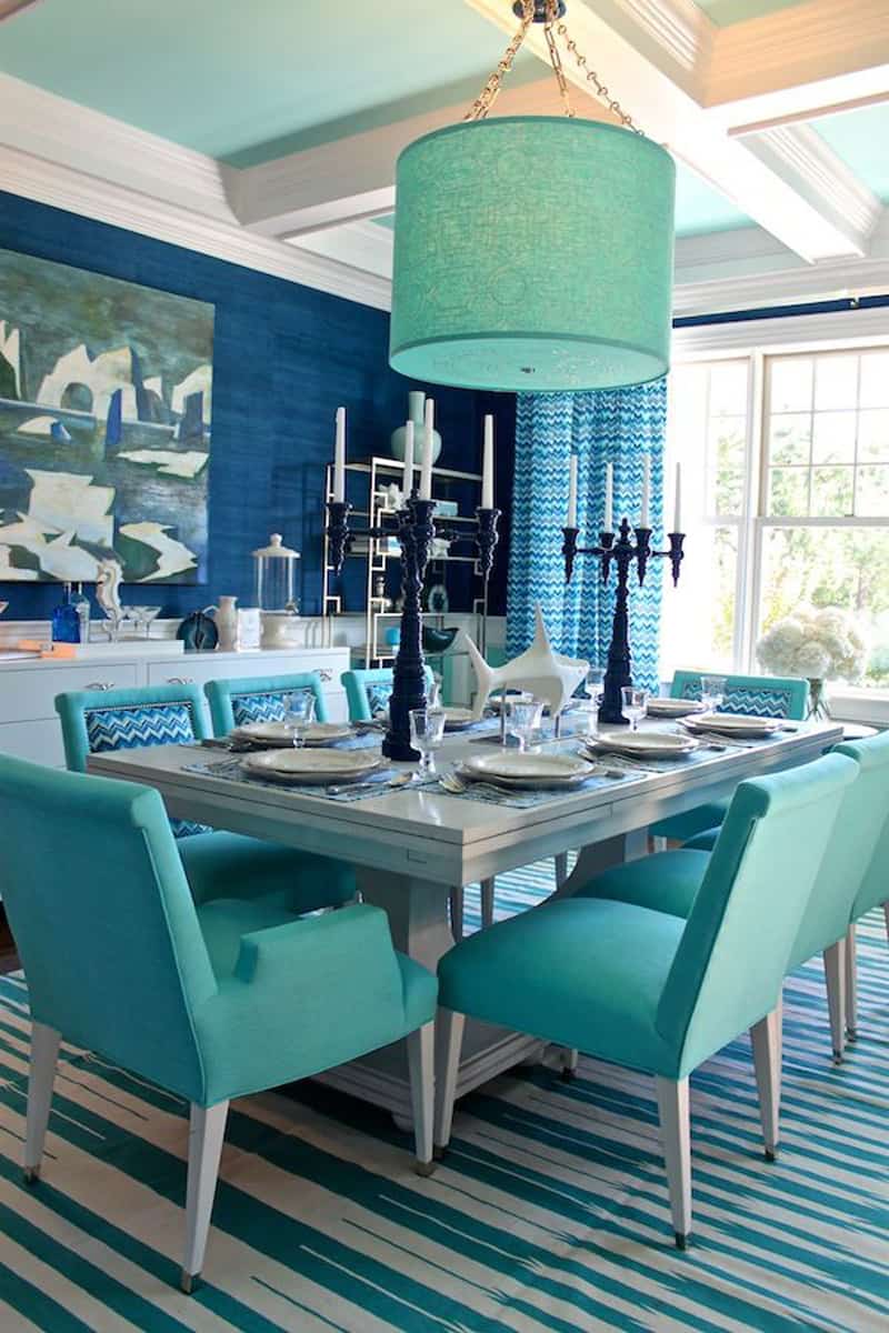
Teal and Turquoise are both a blend of blue and green. Teal, the darker of the two, balances vibrancy with calmness and is often associated with clarity and rejuvenation. Turquoise, however, is much brighter. Named after a gemstone of similar color, Turquoise is reminiscent of the color of tropical oceans. It is a friendly, and cheerful color that radiates the invigorating feeling of a summer’s day. Both shades can be combined with metallics for added luxury or with more neutral palettes for a breezy and tranquil vibe.

Forest
As you might be able to guess, Forest Green is based upon the greens found in nature. This adaptable color is linked to harmony, growth, and freshness found in the earth's plants, trees, and foliage. For a more elegant and mature atmosphere, pair Forest Green with Navy Blue.

Add the neutral color GREEN to your next makeover- and feel the serenity and beautiful life it can bring to your next interior. Need help selecting your special green? Call me. I can help.
908 803-0472
"...the right relationship means everything..."
SERVING THE SOMERSET HILLS AREA ONE CLIENT AT A TIME
Service & Experience
since 1983

